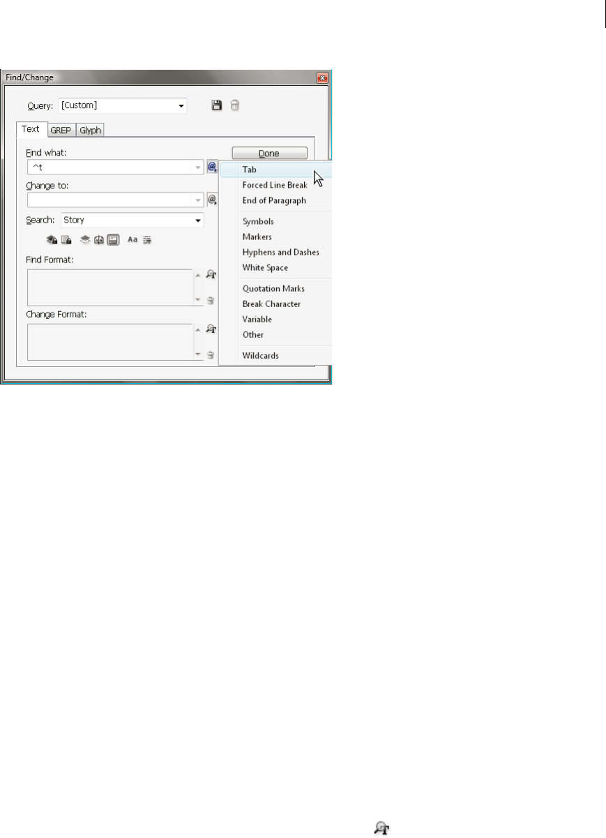
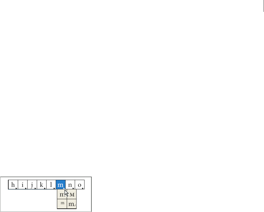
When bunri-kinshi is on, the characters specified in the Bunri-kinshi Characters section of the Kinsoku Settings dialog
box will not be split across lines, and will not be spaced out during full justification.
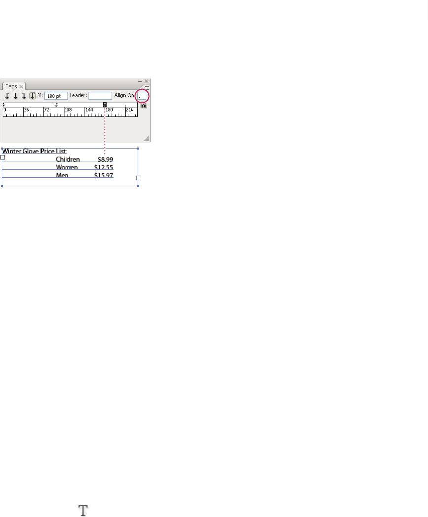
1Select the text you want to affect.
2Choose Bunri-Kinshi from the Paragraph panel menu or Control panel menu.
245
Typography
Last updated 6/15/2014
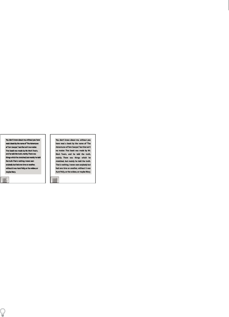
Use rensuuji
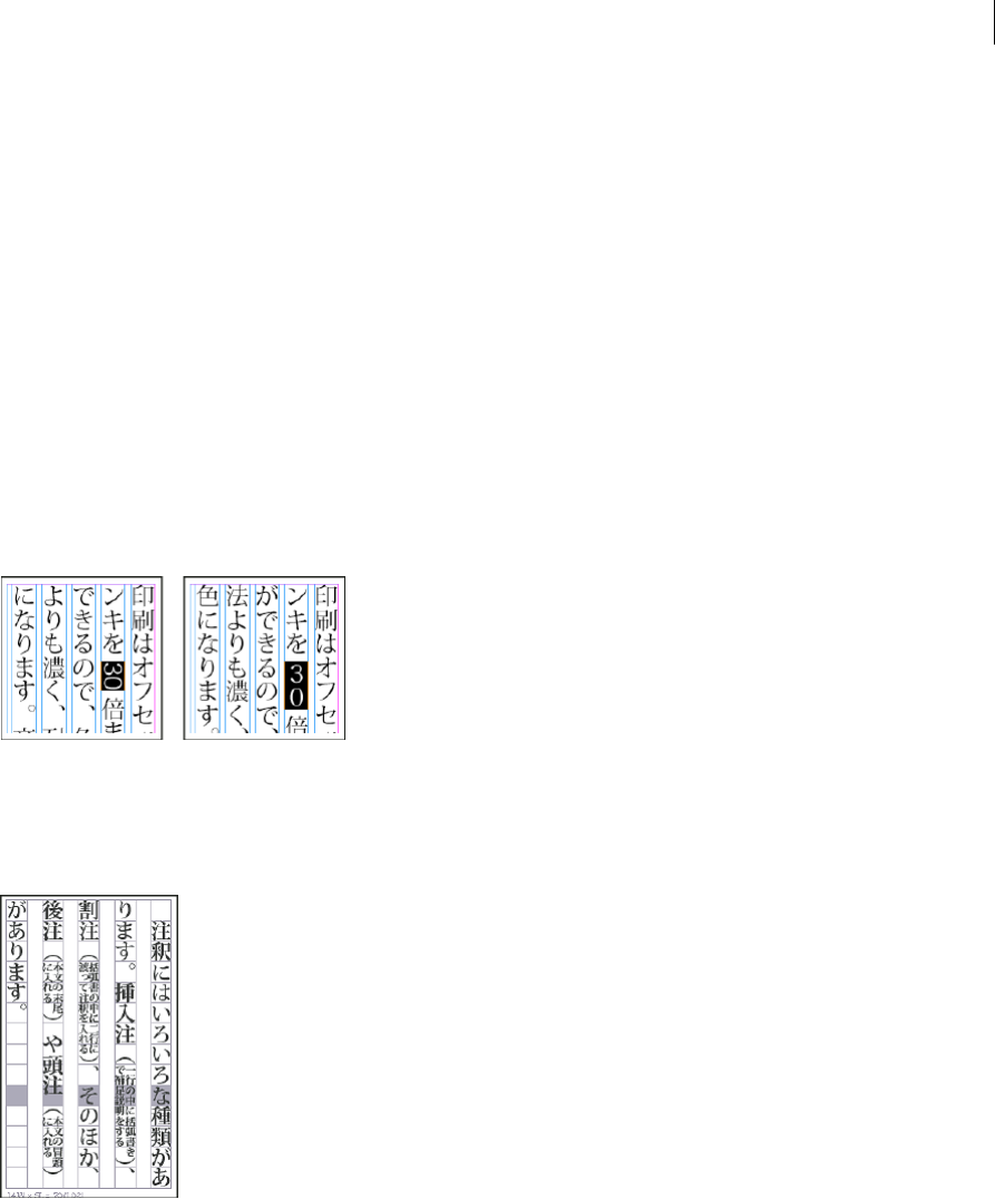
Rensuuji protects numbers from breaking. Furthermore, this option processes punctuation spacing in number strings
according to JIS specifications.
Rensuuji is off (Left) and on (Right).
1Select the text you want to affect.
2To turn rensuuji on, choose Rensuuji from the Paragraph panel menu or Control panel menu.
Absorb ideographic space
If a space falls at the end of the line, the space may wrap to the next line, causing an jagged appearance. You can select
an option to prevent a line from beginning with a space.
1Select the text you want to affect.
2Choose Absorb Ideographic Space At Line End in the Paragraph panel menu or Control panel menu to prevent a
line from beginning with a space.
You can also make this option part of a paragraph style. This option is located in the Japanese Composition Settings
section when creating or editing a style.
Turn off Roman word wrap
When the Arbitrary Hyphenation option is selected, Roman words can be broken without using Roman hyphenation
rules, and no hyphen character (-) appears at the end of the line. If this option is not selected, Roman hyphenation rules
are used for word breaks.
The Arbitrary Hyphenation option takes effect only if a CJK language is applied to the text. This option has no effect
on text to which Roman languages are applied.
1Select the text you want to affect.
2Choose Arbitrary Hyphenation in the Paragraph panel menu or Control panel menu.
You can also make this option part of a paragraph style. This option is located in the Japanese Composition Settings
section when creating or editing a style.
Apply kinsoku hanging
Hanging controls whether or not you hang Japanese punctuation marks such as periods or commas outside the margin,
and align to the edge of the text frame. Specify hanging characters in Hanging Punctuation in the Kinsoku Settings
dialog box.
1Select the text you want to affect.
246
Typography
Last updated 6/15/2014
2To turn on hanging, choose one of the following hanging methods from the Kinsoku Hang Type command in the
Paragraph panel menu or Control panel menu.
NoneNo hanging.
RegularWhen the paragraph is set to justify or justify all lines, positioning is applied to include hanging characters.
ForcedForced When the paragraph is set to justify or align on both sides, the hanging characters are first forced to
hang before positioning is applied. Forced hanging is only applied when paragraph justification is applied.
Rotate half-width characters in vertical text
1Select the text you want to affect.
2From the Paragraph panel menu or Control panel menu, choose Roman rotation in Vertical Text.
The direction of half-width characters such as Roman text or numbers changes in vertical text. By setting Roman
Rotation in Vertical Text, you can rotate these characters vertically in the paragraph.
When you set this option to on, half-width characters are rotated individually.
Roman text before and after rotation
Turn warichu on or off
Warichu can be set as inline note for the body text. Warichu usually consists of two lines enclosed within parentheses.
Text set in warichu
1Select the text.
2Do one of the following.
•Choose Warichu from the Character panel menu or Control panel menu.
•Choose Warichu Settings from the Character panel menu or Control panel menu, select Warichu in the Warichu
Settings dialog box, and then click OK.
247
Typography
Last updated 6/15/2014
Change warichu options
1Select the text you want to affect.
2Choose Warichu Settings from the Character panel menu or Control panel menu.
3For Number Of Lines, specify how many lines of text will appear as warichu characters.
4For Line Spacing, specify the distance between the lines of warichu characters.
5For Warichu Size, select the size of warichu characters as a percentage of the size of the parent text.
6To align Warichu characters, select an alignment option. For example, in a vertical frame grid, selecting Left/Top
aligns the beginning of the warichu characters at the top of the frame. In addition, if Auto is set, justification occurs
automatically based on the warichu size or the parent text. The alignment proxy shows how the warichu text appears
relative to the parent text.
7In the Line Breaking Options section, specify the minimum number of characters required before and after the line
breaks to start a new line, and then click OK
More Help topics
Hyphenate text
Change Justification settings
Use tate-chu-yoko
Changing spacing between characters in CJK text
Adjust kerning for the half-width space between Roman words
❖With the Type tool , select a range of text, and do one of the following:
•To add space between selected words, press Alt+Ctrl+\ (Windows) or Option+Command+\ (Mac OS).
•To remove space between selected words, press Alt+Ctrl+Backspace (Windows) or Option+Command+Delete
(Mac OS).
•To multiply the kerning adjustment by 5, hold down Shift as you press the keyboard shortcut.
Adjust character tsume in CJK composition
Applying tsume to characters causes the space around them to be compressed proportionally. However, the vertical and
horizontal scaling of the characters remains unchanged.
248
Typography
Last updated 6/15/2014
Before tsume (left), and after tsume (right)
1Select the text to which you want to apply tsume.
2Input the percentage in Tsume in the Character panel or the Control panel.
You can also check which tsume or tracking was applied for each character by highlighting the affected text.
Using grid tracking to adjust character spacing
One way in which you can compress aki between characters is to specify the line spacing for the frame grid itself and
adjusting tracking for placed text. This is a form of character compression that uses a feature called Adjust Tracking
With CJK Grid in the Character panel menu or the Control panel (also called grid tracking).
Some characters in CJK fonts are smaller than the embox, resulting in a large aki between characters when they are
placed on the frame grid. Setting tsume in this way for the grid itself is convenient because it allows mojikumi where
characters are properly aligned in the grid. This setting can also be saved as a grid format.
The Character Aki default in the Frame Grid Settings dialog box is set to “0”. In automated typography, this tracking is
known as “Beta”. Setting this to a negative value for mojikumi causes the right grid to overlap the left grid in accordance
with the set value. Characters input to the grid will be aligned on the basis of the center of the each grid, so the spacing
for each character will be compressed. In addition, depending on the mojikumi settings, character forms adjusted to
less than the maximum width will change on the basis of the value proportion of Line Spacing Tsume. For instance,
when mojikumi is set to half spacing for yakumono such as parentheses, by setting the Character Aki in the grid to -1H,
yakumono will be compressed to half of -1H, thus -0.5H. However, because character spacings based on tracking in this
grid are not applied to Roman text, character spacing for Roman text will not be compressed in line with tracking. In
addition, because this tracking value is applied to the grid itself, it is handled as an absolute value. For this reason, even
if the text font size changes, the tracking value does not.
This feature is enabled by default. To disable this feature, select Adjust Tracking With CJK Grid from the Character
panel menu or Control panel, and deselect the box to the left of the item name.
Adjust tracking by using Grid Jidori
You can justify text for specified grid characters by setting grid jidori. For example, if you select 3 characters entered
and set jidori to 5, the 3 characters will be spread evenly across the grid for 5 character spaces.
1Select a range of characters.
2In Grid Jidori in the Character panel or Control panel, enter a value in the text box or select one from the pop-up
menu.
Note: Use the Grid Jidori feature in the frame grid. It may not function properly in a text frame.
249
Typography
Last updated 6/15/2014
More Help topics
Highlight text containing custom kerning and tracking
Use mojikumi
Set paragraph gyoudori
Formatting characters
For a video tutorial on formatting characters, see www.adobe.com/go/lrvid4275_id.
Apply baseline shift
Use Baseline Shift to move a selected character up or down relative to the baseline of the surrounding text. This option
is especially useful when you’re hand-setting fractions or adjusting the position of inline graphics.
Baseline shift values applied to text
1Select text.
2In the Character panel or Control panel, type a numeric value for Baseline Shift . Positive values move the
character’s baseline above the baseline of the rest of the line; negative values move it below the baseline.
To increase or decrease the value, click in the Baseline Shift box, and then press the Up or Down Arrow key. Hold down
Shift while you press the Up or Down Arrow key to change the value in greater increments.
To change the default increment for baseline shift, specify a value for Baseline Shift in the Units & Increments section
of the Preferences dialog box.
Make characters superscript or subscript in a non-OpenType font
1Select text.
2Choose Superscript or Subscript in the Character panel menu or in the Control panel.
When you choose Superscript or Subscript, a predefined baseline shift value and type size are applied to the selected
text.
The values applied are percentages of the current font size and leading, and are based on settings in the Type Preferences
dialog box. These values do not appear in the Baseline Shift or Size boxes of the Character panel when you select the
text.
Note: You can change the default size and position of superscripts and subscripts using Advanced Type preferences.
Apply underline or strikethrough
The default weight of an underline and strikethrough depends on the size of the type.
Jeff Witchel provides a video tutorial about underlining at Custom Underlines in InDesign.
250
Typography
Last updated 6/15/2014
Apply underline or strikethrough
1Select text.
2Choose Underline or Strikethrough in the Character panel menu or the Control panel.
Change underline or strikethrough options
Creating custom underlining is especially useful when you want to create an even underline below characters of
different sizes, or for creating special effects, such as background highlighting.
Before and after adjusting underlines
1From the Character panel menu or the Control panel menu, choose Underline Options or Strikethrough Options.
2Do any of the following, and then click OK:
•Select Underline On or Strikethrough On to turn on underline or strikethrough for the current text.
•For Weight, choose a weight or type a value to determine the thickness of the underline or strikethrough line.
•For Type, select one of the underline or strikethrough options.
•For Offset, determine the vertical position of the line. The offset is measured from the baseline. Negative values
move the underline above the baseline and the strikethrough below the baseline.
•Select Overprint Stroke when you want to make sure that the stroke doesn’t knock out underlying inks on a
printing press.
•Choose a color and tint. If you specified any line type other than solid, choose a gap color or gap tint to change
the appearance of the area between dashes, dots, or lines.
•Select Overprint Stroke or Overprint Gap if the underline or strikethrough will be printed over another color,
and you want to avoid errors that can occur with printing misregistration.
To change the underline or strikethrough options in a paragraph or character style, use the Underline Options or
Strikethrough Options section of the dialog box that appears when you create or edit the style.
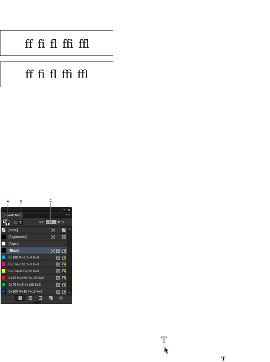
Apply ligatures to letter pairs
InDesign can automatically insert ligatures, which are typographic replacement characters for certain letter pairs, such
as “fi” and “fl,” when they are available in a given font. The characters that InDesign uses when the Ligature option is
selected appear and print as ligatures, but are fully editable, and do not cause the spell checker to flag a word
erroneously.
251
Typography
Last updated 6/15/2014
Individual characters (top) and ligature combinations (bottom)
With OpenType fonts, when you choose Ligatures from the Character panel menu or Control panel menu, InDesign
produces any standard ligature defined in the font, as determined by the font designer. However, some fonts include
more ornate, optional ligatures, which can be produced when you choose the Discretionary Ligatures command.
1Select text.
2Choose Ligatures from the Character panel menu or the Control panel menu.
Change the color, gradient, or stroke of text
You can apply colors, gradients, and strokes to characters and continue to edit the text. Use the Swatches panel and
Stroke panel to apply colors, gradients, and strokes to text, or change Character Color settings when creating or editing
a style.
Swatches
A Swatch affects fill or stroke B Swatch affects container or text C Tint percentage
1Do one of the following:
•To apply color changes to text inside a frame, use the Type tool to select text.
•To apply color changes to all text in a frame, use the Selection tool to select the frame. When applying color to
the text rather than the container, make sure that you select the Formatting Affects Text icon in the Tools panel
or in the Swatches panel.
2In the Tools panel or in the Swatches panel, select whether you want to apply the color change to the fill or stroke.
If you select Stroke, the color change affects only the outline of characters.
252
Typography
Last updated 6/15/2014
3Do any of the following:
•In the Swatches panel, click a color or gradient swatch.
•In the Stroke panel, specify a weight or other stroke options. (See Stroke panel options .)
You can also apply a gradient to text by dragging across the selected text using either the Gradient Swatch tool or
the Gradient Feather tool .
To create reverse type, you can change the text fill color to white or [Paper] and the frame’s fill color to a dark color. You
can also create reverse type by using a paragraph rule behind text; however, if the rule is black, you’ll need to change
the type to white.
Change the color and gradient of text
You can apply colors and gradients to the stroke and fill of characters with the Swatches panel. For a linked story, you
can apply any colors or gradients defined by the linked InDesign layout. For a stand-alone story, you can apply any of
the default colors or new colors you create for the document.
Note: You cannot create gradients in InCopy. Gradients only appear when imported from InDesign.
Swatches
A Swatch affects fill or stroke B Swatch affects container or text C Tint percentage
Change the color of text
1Using the Type tool , select the text you want to color.
2In the Swatches panel (choose Window > Swatches), click a color or gradient swatch.
Note: You can apply colors to text in either Galley, Story, or Layout view; however, color changes are visible only in Layout
view.
Specify the type of swatches to display
1Choose Window > Swatches to open the Swatches panel.
2At the bottom of the panel, specify one of the following:
•To see all color, tint, and gradient swatches, click the Show All Swatches button.
•To see only process color, spot color, and tint swatches, click the Show Color Swatches button.
•To see only gradient swatches, click the Show Gradient Swatches button.
253
Typography
Last updated 6/15/2014
Add transparency effects to text
Use the Effects panel to add transparency effects, such as drop shadows, to text.
Mike Rankin provides examples about transparency effects at InDesign Eye Candy, Part I.
1Use the Selection tool to select the text frame.
2Choose Object > Effects > [effect].
3Choose Text from the Settings For menu.
You can choose Object if you want the effects you choose to apply to the text frame’s stroke and fill as well as the text
inside it.
4Specify the effect attributes and click OK.
If you want to change the text’s blending mode or opacity settings, make these changes on the Effects panel.
Assign a language to text
Assigning a language to text determines which spelling and hyphenation dictionary is used. Assigning a language does
not change the actual text.
1Do any of the following:
•To apply the language only to selected text, select the text.
•To change the default dictionary used in InDesign, choose the language with no documents open.
•To change the default dictionary for a specific document, open the document, choose Edit > Deselect All, and
then choose the language.
2In the Character panel, choose the appropriate dictionary in the Language menu.
InDesign uses Proximity (and WinSoft for some languages) dictionaries for both spelling and hyphenation. These
dictionaries let you specify a different language for as little as a single character of text. Each dictionary contains
hundreds of thousands of words with standard syllable breaks. Changing the default language does not affect existing
text frames or documents.
You can customize language dictionaries to ensure that any unique vocabulary you use is recognized and treated
correctly.
InDesign includes a language locking feature that prevents CJK text from being assigned a non-CJK language.
How dictionaries affect hyphenation
A “Glockenspiel” in English B “Glockenspiel” in Traditional German C “Glockenspiel” in Reformed German
254
Typography
Last updated 6/15/2014
Change the case of type
The All Caps or Small Caps commands change the appearance of text, but not the text itself. Conversely, the Change
Case command changes the case setting of selected text. This distinction is important when searching or spell-checking
text. For example, suppose you type “spiders” in your document and apply All Caps to the word. Using Find/Change
(with Case Sensitive selected) to search for “SPIDERS” will not find the instance of “spiders” to which All Caps was
applied. To improve search and spell-check results, use the Change Case command rather than All Caps.
Anne-Marie Concepcion provides an article about small caps at Small Caps vs OpenType All Small Caps.
Change text to All Caps or Small Caps
All caps is a method used to capitalize all Roman text. Small caps is a method used to capitalize all Roman text and
make it the approximate size of lowercase characters.
InDesign can automatically change the case of selected text. When you format text as small caps, InDesign
automatically uses the small-cap characters designed as part of the font, if available. Otherwise, InDesign synthesizes
the small caps using scaled-down versions of the regular capital letters. The size of synthesized small caps is set in the
Type Preferences dialog box.
Before (top) and after (bottom) setting BC and AD in small caps to complement old-style numerals and surrounding text
If you select All Caps or Small Caps in an OpenType font, InDesign creates more elegant type. If you’re using an
OpenType font, you can also choose All Small Caps from the Character panel menu or the Control panel. (See
Apply
OpenType font attributes .)
1Select text.
2Choose All Caps or Small Caps in the Character panel menu or in the Control panel. If the text was originally typed
in all caps, selecting Small Caps will not change the text.
Specify the size for small caps
1Choose Edit > Preferences > Advanced Type (Windows) or InCopy > Preferences > Advanced Type (Mac OS).
2For Small Caps, type a percentage of the original font size for text to be formatted as small caps. Then click OK.
Change capitalization
1Select text.
2Choose one of the following in the Type > Change Case submenu:
•To change all characters to lowercase, choose Lowercase.
•To capitalize the first letter of each word, choose Title Case.
•To change all characters to uppercase, choose Uppercase.
•To capitalize the first letter of each sentence, choose Sentence Case.
255
Typography
Last updated 6/15/2014
Note: The Sentence Case command assumes that the period (.), exclamation point (!), and question mark (?) characters
mark the ends of sentences. Applying Sentence Case may cause unexpected case changes when these characters are used in
other ways, as in abbreviations, file names, or Internet URLs. In addition, proper names may become lowercase when they
should be uppercase.
Scale type
You can specify the proportion between the height and width of the type, relative to the original width and height of
the characters. Unscaled characters have a value of 100%. Some type families include a true expanded font, which is
designed with a larger horizontal spread than the plain type style. Scaling distorts the type, so it is generally preferable
to use a font that is designed as condensed or expanded, if one is available.
Scaling fonts horizontally
A Unscaled type B Unscaled type in condensed font C Scaled type in condensed font
Adjust vertical or horizontal scaling
1Select text you want to scale.
2In the Character panel or Control panel, type a numeric value to change the percentage of Vertical Scaling or
Horizontal Scaling .
If the Use New Vertical Scaling in Vertical preference option is selected, the X and Y scale for Roman glyphs in vertical
text will be reversed, making all text in the line scale in the same direction. (See
Change CJK composition preferences.)
If the Adjust Line Height With Char Scale option is selected in the Character panel menu, the Y scale of glyphs affects
line height. When scaling frame grids, the Y scale is affected, so you may want to adjust the line height to avoid auto-
gyoudori occurring on the scaled grid.
Scale text by resizing the text frame in InDesign
❖Do any of the following:
•Using the Selection tool, hold down Ctrl (Windows) or Command (Mac OS), and then drag a corner of the text
frame to resize it.
•Using the Scale tool , resize the frame.
(See Scale objects .)
256
Typography
Last updated 6/15/2014
Determine the appearance of scaled text values
When you change the scale of a frame, the text inside the frame is also scaled. For example, when you double the size
of a text frame, the text also doubles in size; 20-point text increases to 40 points.
David Blatner provides an article about scaled text frames at Making a Magnifying Glass Text Frame in InDesign.
You can change a preferences option to indicate how scaled text appears in panels:
•By default, with Apply To Content selected, the Font Size boxes in the Control panel and Character panel list the
new size of text (such as 40 pt). If you select the Adjust Scaling Percentage option, the Font Size boxes display both
the original and the scaled size of the text, such as “20 pt (40).”
•The scaling values in the Transform panel tell you the horizontal and vertical percentage by which the frame was
scaled. By default, with Apply To Content selected, scaling values display at 100% after a text is scaled. If you select
the Adjust Scaling Percentage option, the scaling values reflect the scaled frame, so doubling the scale of a frame
displays as 200%.
Tracking scale changes to frames is useful if you have to revert a frame and the text inside it to their original size. It’s
useful as well for finding out by how much you changed the size of a frame. To track scale changes to frames and the
text inside these frames:
1Choose Edit > Preferences > General (Windows) or InDesign > Preferences > General (Mac OS).
2Select Adjust Scaling Percentage, and then click OK.
Note the following:
•The Adjust Scaling Percentage preference applies to frames that you scale after the preference is turned on, not to
existing frames.
•The Adjust Scaling Percentage preference stays with the text. The scaled point size continues to appear in
parentheses even if you turn off the Adjust Scaling Percentage preference and scale the frame again.
•To remove the scaled point size from the Transform panel, choose Redefine Scaling as 100% in the Transform panel.
Choosing this option doesn’t change the appearance of the scaled frame.
•If you edit the text or scale a frame within threaded frames when the Adjust Scaling Percentage preference is
selected, the text is scaled, even if it moves to a different frame. However, if Apply To Content is selected, any text
that flows to a different frame as a result of editing is no longer scaled.
Skew type
1Select text.
2In the Character panel, type a numeric value for Skewing . Positive values slant type to the right; negative values
slant type to the left.
Note that applying an angle to type does not produce true italic characters.
More Help topics
Apply OpenType font attributes
OpenType fonts
Applying color
Add rules (lines) above or below paragraphs
Applying gradients to text
257
Typography
Last updated 6/15/2014
Transparency effects
Hyphenation and spelling dictionaries
Formatting CJK characters
Apply shatai to text
In traditional typesetting technology, characters were slanted by using a lens to distort the glyphs when being set on
film. This oblique style is known as shatai. Shatai is distinct from a simple slant of the glyphs, because it also scales the
glyphs. You can adjust the magnification or angle of text you want to slant from the center point, without changing the
height of the glyph, using the shatai feature in InDesign.
Shatai
A No scale applied B Magnification 30%, 45 shatai C Selecting the Adjust Tsume option D Selecting the Adjust Rotation option
1Select text.
2Select Shatai from the Character panel menu or Control panel menu.
3Specify the following options, and click OK:
•Specify the degree of skew in Magnification (In traditional typesetting technology terms, 10% magnification is
lens 1, and 40% magnification is lens 4).
•Set the angle of obliqueness to 30, 45, or 60, in Angle.
•Select Adjust Rotation to rotate the glyphs, and display horizontal lines horizontally for horizontal text, and
vertical lines vertically for vertical text.
•Select Adjust Tsume to apply jidori.
You can fine tune the rotated oblique effect for individual characters, after applying shatai to text.
Rotate characters
1Select the characters.
2In the Character panel, type a value for Character Rotation Specify a minus value to rotate the character to the
right (clockwise).
258
Typography
Last updated 6/15/2014
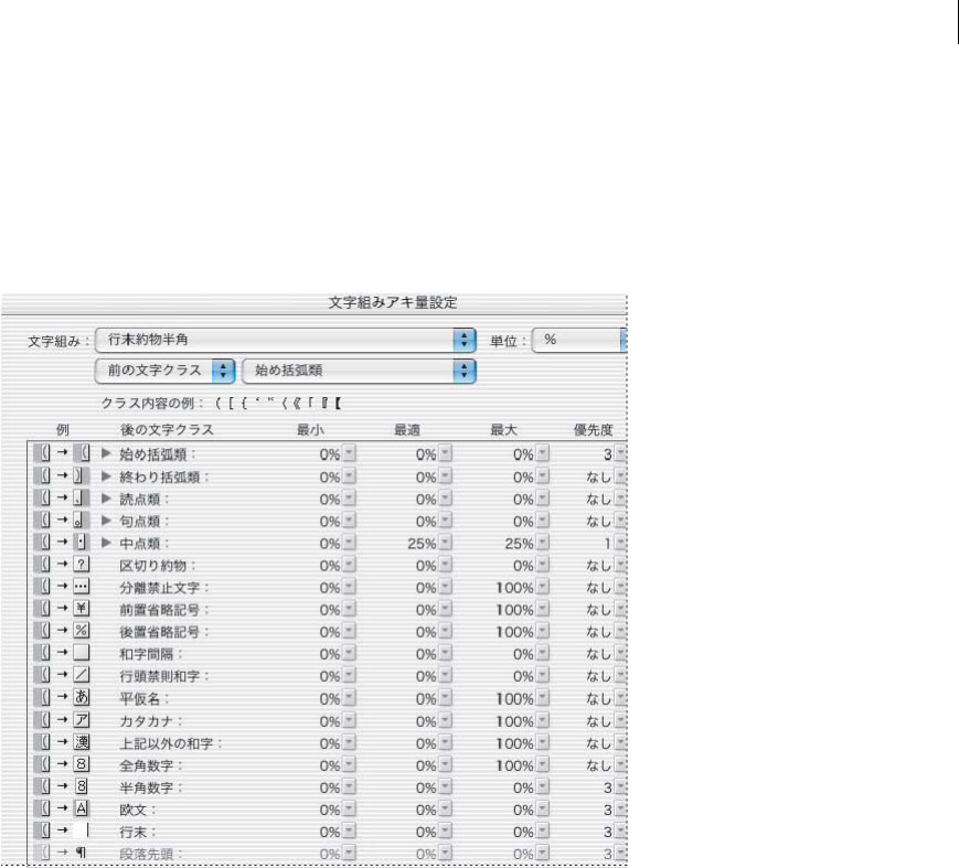
Adjust aki before and after characters
1Select opening parenthesis or closing parenthesis with the type tool.
2Choose the amount of aki you want to add from the Mojikumi Before Character or Mojikumi After Character
pop-up menu, in the Character panel.
For example, if you specify 2bu, half a full-width space is added, and if you specify 4bu, a quarter of a full-width space
is added. This aki will not be adjusted when the line is set to full justification. Adjusting aki is especially useful to
override Mojikumi Akiryo Settings for certain characters.
Adding aki before opening parenthesis
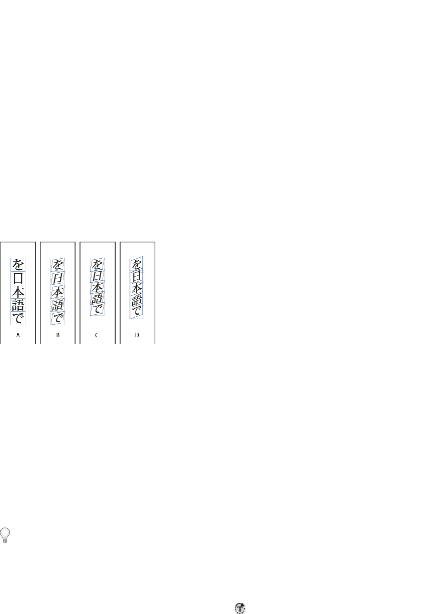
Use tate-chu-yoko
Using tate-chu-yoko (also known as kumimoji or renmoji) is an option to make a part of the text horizontal, in vertical
text. It is easier to read half-width characters such as numbers, dates, and short foreign words in a vertical text frame,
by rotating the text.
Before and after applying tate-chu-yoko
You can move text left, right, up, and down when you turn on the Tate-chu-yoko option. You can also set Auto Tate-
chu-yoko for special half-width characters. Auto Tate-chu-yoko is set in the paragraph attributes.
Use tsume or tracking in the Character panel to adjust the character spacing for Tate-chu-yoko.
Apply tate-chu-yoko
1Select the text to which you want to apply tate-chu-yoko.
2Do one of the following:
•Choose Tate-chu-yoko from the Character panel menu or Control panel menu.
•Choose Tate-chu-yoko Settings from the Character panel menu or Control panel menu, choose Tate-chu-yoko
in the Tate-chu-yoko dialog box, and click OK.
259
Typography
Last updated 6/15/2014
If multiple instances of tate-chu-yoko appear next to each other, use the Non-joiner character to keep them separate.
Choose Type > Insert Special Character > Other > Non-joiner.
Remove tate-chu-yoko
1Select the text to which you want to apply tate-chu-yoko.
2Do one of the following:
•Choose and cancel Tate-chu-yoko from the Character panel menu or Control panel menu.
•Choose Tate-chu-yoko Settings from the Character panel menu, deselect Tate-chu-yoko in the Tate-chu-yoko
dialog box, and then click OK.
Change tate-chu-yoko settings
1Choose Tate-chu-yoko Settings from the Character panel menu.
2Specify a value for moving the text up or down in X Offset. If you specify a plus value, the text will move up, and if
you specify a minus value, it will move down.
3Specify a value for moving the text left or right in Y Offset. If you specify a plus value, the text will move to the right,
and if you specify a minus value, it will move to the left.
Set Auto Tate-chu-yoko for specific paragraphs
1Select the text to be set to Auto Tate-chu-yoko, or place the text insertion point in the paragraph.
2Choose Auto Tate-chu-yoko from the Paragraph panel menu.
3In KumiNumber, specify the number of successive half-width characters that you want to rotate to vertical
orientation. For example, if this is set to 2, the character string "123" will not rotate, while "12" will.
4If you want to apply tate-chu-yoko to roman text, select Include Roman Characters, and click OK.
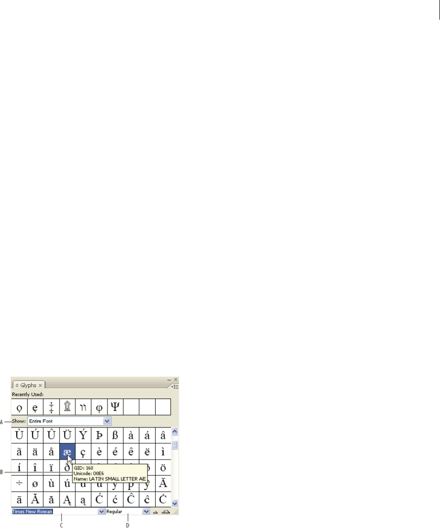
Add Ruby to text
In Japanese, Ruby (also known as furigana) is normally used to show the kanji yomi in hiragana. In Simplified Chinese,
Ruby is called Pinyin, while in Traditional Chinese, Ruby is called Chuyin. InDesign provides full support to Japanese
Ruby and limited support to Chinese Pinyin or Chuyin. You can adjust Ruby settings to specify Ruby location, size, or
color. Furthermore, when the ruby is longer than the parent you can specify the ruby distribution. You can also apply
tate-chu-yoko to Ruby.
Ruby on horizontal text (left), and ruby to the right of vertical text (right)
When the parent to which you want to attach ruby covers two lines, the ruby will follow when the parent moves to the
next line.
Note: In some instances, such as when applying a style that includes a variable, Ruby characters may be removed.
1Select the text to which you want to attach ruby. You cannot attach ruby when there are forced line breaks in the
selected text.
260
Typography
Last updated 6/15/2014
2Select Ruby > Ruby from the Character panel menu or Control panel menu.
3Enter the ruby characters in Ruby.
4Change Ruby settings by clicking an option on the left side of the dialog box and specifying settings.
5Click OK.
Ruby settings
The following options appear in the different panels of the Ruby dialog box.
Ruby Placement and Spacing
•From the Type menu, choose Per-Character or Group Ruby. When Per Character Ruby is selected, enter a half or
full width space when inputting Ruby characters to separate them in line with their parent characters. For
"hakunetsutou" for example, enter as "haku netsu tou" (example of a word composed of Japanese characters and its
phonetic spelling is given).
Ruby
•From the Alignment menu, specify the position of the Ruby characters. You can check the position with the graphic
shown in the sample field.
•To attach ruby above horizontal text or to the right of vertical text, select Above/Right, and to attach below
horizontal text or to the left of vertical text, select Below/Left in Placement.
•Specify the spacing between the ruby and the parent in XOffset and YOffset. When you enter a minus value, the
ruby moves closer to the parent.
Ruby Font and Size
•Select a font family and font style in Font.
•Specify the size of the ruby characters in Size. The default ruby size is half the size of the parent.
•Specify the scale for the height and width of the ruby characters in Horizontal Scale and Vertical Scale.
•Select Use Open Type Pro Ruby Glyphs to use alternate glyphs for ruby (when possible). Specific kana characters
are available for some Open Type Pro fonts. When you select this option, the specific font for ruby characters, and
not the standard kana font, will be used.
•In KumiNumber, specify the number of successive half-width characters that you want to rotate to vertical
orientation. For example, if this is set to 2, the character string "123" will not rotate, while "12" will.
•Select Include Roman Characters to apply tate-chu-yoko to roman text.
•Select Scale to Fit to force the tate-chu-yoko to have the same dimensions (1 em x 1 em) in the ruby string, either
using an OpenType feature or scaling the glyphs.
261
Typography
Last updated 6/15/2014
Adjustment When Ruby Is Longer Than Parent
•With Overhang, when the total Ruby width is greater than that of their parent characters, the specified Ruby will
overflow widthways into the space above characters either side of the parents. For Japanese, character types
compatible with Overhang comply with the JISx4051-1995 specification.
•Specify the parent character spacing necessary for attaching ruby in Spacing. When you select a different option, the
graphics displayed in the sample field are updated.
•To automatically adjust the ruby character width, select Char Width Scaling, and specify the compression scale for
the width of the ruby characters.
•Select Auto Align at Line Edges to align the parent with the start and end of the line.
Ruby Color
•Select a color swatch in the list box.
•Specify the degree of tinting and line weight, as necessary.
•Select Overprint Fill or Overprint Stroke to set filling or stroke overprint for ruby characters.
(See Determining when to overprint manually .)
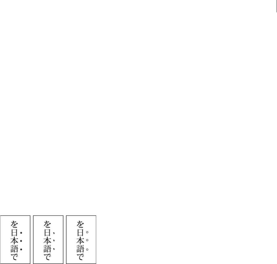
Apply kenten
Kenten (also known as Boten) are points which you attach to text you want to highlight. You can select the type of points
from existing kenten forms, or specify customized kenten characters. You can also specify the position, scale, and color
by adjusting the kenten settings.
Small black circle kenten, black sesame kenten, and small white circle kenten applied to text
Apply kenten
1Choose the characters you want to highlight.
2Choose a kenten character, such as Fisheye or White Circle, from Kenten in the Character panel menu or Control
panel menu.
Change kenten settings and color
1Choose Kenten > Kenten from the Character panel menu or Control panel menu.
2For Kenten Settings, specify the options below:
Kenten TypeSelect a kenten character, such as Fisheye or White Circ le. Choose Custom to specify a custom
character. You can enter characters directly, or you can specify a character code value for the specified character set.
PositionSpecify the spacing between the kenten and characters.
LocationSelect Above/Right to attach kenten above horizontal text or to the right of vertical text, and Below/Left
to attach below horizontal text or to the left of vertical text.
SizeSpecify the size of the kenten character.
262
Typography
Last updated 6/15/2014
AlignSpecify whether the kenten should be displayed in the center (Center) or to the left (Left) (above for vertical
text) of the character's embox.
H/Scale and V/ScaleSpecify the scale for the height and width of the kenten character.
3To change the color of the kenten, choose Kenten Color from the list box, and then specify the options below:
•Select a color swatch from the list box.
•Specify the degree of tinting and line weight, as necessary.
•Select Overprint Fill or Overprint Stroke to set filling or stroke overprint for kenten characters.
(See Determining when to overprint manually .)
4Click OK.
Align text of different sizes
You can specify how to align text to the largest characters in a line using the Character Alignment option, when
positioning characters of different sizes in 1 line. It is possible to align characters to the top, center or bottom of the
embox (right, center, and left for vertical frames), to the roman baseline, and to the top or bottom of the ICF box (right
or left for vertical frames). ICF (Ideographic Character Face) is the average height and width used by the font designer
to design the ideographic characters which comprise a font.
Align different sizes
A Align different size letters above full space letters B Align different size letters in the middle of full space letters C Align different size letters
below full space letters
Note: The Character Alignment option is not effective, even if applied, when all characters are the same size in a line.
1Select a range of text or lines for the characters you want to align, or select a text frame using the selection tool.
2Choose one of the following options from Character Alignment in the Character panel menu or Control panel
menu.
•Roman Baseline aligns the small characters in a line to the large character baseline grid.
•Embox Top/Right, Center, or Embox Bottom/Left align the small characters in a line to the specified position of
the large characters embox. In vertical text frames, Embox Top/Right aligns the text to the right of the embox,
and Embox Bottom/Left aligns the paragraph to the left of the embox.
•ICF Top/Right and ICF Bottom/Left align the small characters in a line to the ICF specified by the large
characters. In vertical text frames, ICF Top/Right aligns the text to the right of the ICF, and ICF Bottom/Left to
the left of the ICF.
263
Typography
Last updated 6/15/2014
More Help topics
Change the text direction
Align paragraphs to a baseline grid
Formatting paragraphs
For a video tutorial on formatting paragraphs, see www.adobe.com/go/lrvid4276_id.
Adjust paragraph spacing
You can control the amount of space between paragraphs. If a paragraph begins at the top of a column or frame, InCopy
does not honor the Space Before value. In such a case, you can increase the leading of the first line of the paragraph or
increase the top inset of the text frame in InDesign.
1Select text.
2In the Paragraph panel or the Control panel, adjust the appropriate values for Space Before and Space After .
To ensure formatting consistency, change paragraph spacing in the paragraph styles you define.
Use drop caps
You can add drop caps to one or more paragraphs at a time. The drop cap’s baseline sits one or more lines below the
baseline of the first line of a paragraph.
The size of drop cap text differs depending on whether the drop cap characters in the first line are half-width roman or
full-width CJK. When the drop cap characters in the first line are half-width roman, the cap height of the drop cap
matches the cap height of the first line of text in the paragraph, and the Roman baseline of the drop cap matches the
baseline of the last drop cap line in the paragraph. The embox top of the drop cap matches the embox top of the first
line of the paragraph, and the embox bottom of the drop cap matches the embox bottom of the last drop cap line in the
paragraph.
You can also create a character style that can be applied to the drop-cap characters. For example, you can create a tall
cap (also called a raised cap) by specifying a 1-line, 1-character drop cap and applying a character style that increases
the size of the first letter.
One-character, three-line drop cap (left), and five-character, two-line drop cap (right)
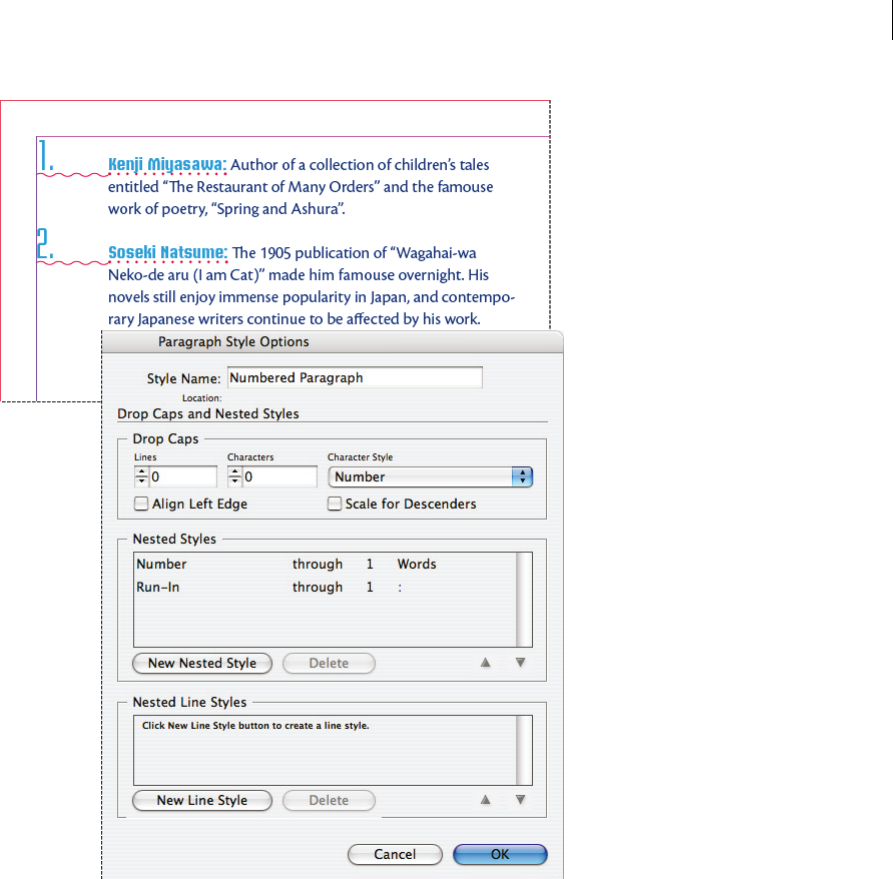
Create a drop cap
1With the Type tool selected, click in the paragraph where you want the drop cap to appear.
2In the Paragraph panel or Control panel, type a number for Drop Cap Number Of Lines to indicate the number
of lines you want the drop cap to occupy.
264
Typography
Last updated 6/15/2014
3For Drop Cap One Or More Characters , type the number of drop cap characters you want.
4To apply a character style to the drop cap character, choose Drop Caps And Nested Styles from the Paragraph panel
menu, and then choose the character style you created.
You can also use the Drop Caps And Nested Styles dialog box to align the drop cap to the text edge, reducing the
amount of space on the left side of the drop cap, and adjust for drop cap letters with descenders, such as “g” and “y.”
If you want to resize, skew, or change the typeface of the drop cap letter for added effect, select the letter or letters and
make the formatting changes.
You can also use the Drop Caps And Nested Styles dialog box to adjust the drop cap in different way. You can align
the drop cap to the text edge, scale for descenders, ignore the frame grid, pad to the frame grid, and scale up or down
to the grid.
Remove a drop cap
1With the Type tool selected, click in the paragraph where the drop cap appears.
2In the Paragraph panel or Control panel, type 0 for Drop Cap Number Of Lines or Drop Cap Number Of Characters.
Add rules (lines) above or below paragraphs
Rules are paragraph attributes that move and are resized along with the paragraph on the page. If you’re using a rule
with headings in your document, you may want to make the rule part of a paragraph style definition. The width of the
rule is determined by the column width.
The offset for a rule above a paragraph is measured from the baseline of the top line of text to the bottom of the rule.
The offset for a rule below a paragraph is measured from the baseline of the last line of text to the top of the rule.
Placement of rules
A Rule above paragraph B Rule below paragraph
Michael Murphy provides a video tutorial about creating special effects using paragraph rules at Paragraph Rules Rule.
Creative Curio provides an article about creative uses of paragraph rules at Creative Uses for Paragraph Rules in
InDesign, Pt 1.
Add a rule above or below a paragraph
1Select text.
2Choose Paragraph Rules from the Paragraph panel menu or Control panel menu.
3At the top of the Paragraph Rule dialog box, select Rule Above or Rule Below.
4Select Rule On.
265
Typography
Last updated 6/15/2014
Note: If you want both a rule above and below, make sure that Rule On is selected for both Rule Above and Rule Below.
5Select Preview to see what the rule will look like.
6For Weight, choose a weight or type a value to determine the thickness of the rule. For Rule Above, increasing the
weight expands the rule upwards. For Rule Below, increasing the weight expands the rule downward.
7Select Overprint Stroke when you want to make sure that the stroke doesn’t knock out underlying inks on a printing
press.
8Do one or both of the following:
•Choose a color. The available colors are those listed in the Swatches panel. Select the Text Color option to make
the rule the same color as the first character in the paragraph for Rule Above and the last character for Rule
Below.
•Choose a tint or specify a tint value. The tint is based on the color you specified. Note that you can’t create tints
of the built-in colors None, Paper, Registration, or Text Color.
•If you specified any line type other than solid, choose a gap color or gap tint to change the appearance of the area
between dashes, dots, or lines.
9Choose the width of the rule. You can choose either Text (from the left edge of text to the line end) or Column (from
the left edge of the column to the right edge of the column). If the left edge of the frame has a column inset, the rule
begins at the inset.
10To determine the vertical position of the rule, type a value for Offset.
11To make sure that the rule above text is drawn within the text frame, select Keep In Frame. If this option isn’t
selected, the rule can appear outside the text frame.
To make sure the paragraph rule at the top of one column aligns with the text at the top of the adjacent column,
select Keep In Frame.
12Set left or right indents for the rule (not for text) by typing values for Left Indent and Right Indent.
13Select Overprint Stroke if the paragraph rule will be printed over another color and you want to avoid errors that
can occur with printing misregistration. Then click OK.
Remove a paragraph rule
1Using the Type tool , click in the paragraph containing the paragraph rule.
2Choose Paragraph Rules from the Paragraph panel menu or Control panel menu.
3Deselect Rule On and click OK.
Ways to control paragraph breaks
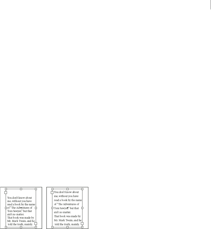
You can eliminate orphans and widows, words or single lines of text that become separated from the other lines in a
paragraph. Orphans fall at the bottom of a column or page, and widows fall at the top of a column or page. Another
typographic problem to avoid is a heading that stands alone on a page with the following paragraph on the next page.
You have several options for fixing widows, orphans, short exit lines, and other paragraph break problems:
Discretionary hyphensA discretionary hyphen (Type > Insert Special Character > Hyphens And Dashes >
Discretionary Hyphen) appears only if the word breaks. This option prevents the common typographic problem of
hyphenated words, such as “care-giver,” appearing in the middle of a line after text reflows. Similarly, you can also add
a discretionary line break character.
No BreakChoose No Break from the Character panel menu to prevent selected text from breaking across a line.
266
Typography
Last updated 6/15/2014
Nonbreaking spacesInsert a nonbreaking space (Type > Insert White Space > [nonbreaking space]) between words you
want to keep together.
Keep OptionsChoose Keep Options from the Paragraph panel menu to specify how many lines in the following
paragraph remain with the current paragraph.
Start ParagraphUse Start Paragraph in the Keep Options dialog box to force a paragraph (usually a title or heading)
to appear at the top of a page, column, or section. This option works especially well as part of a heading paragraph style.
Hyphenation SettingsChoose Hyphenation from the Paragraph panel menu to change hyphenation settings.
Edit textEditing text may not be an option depending on the kind of document you work with. If you have license to
rewrite, then subtle rewording can often create a better line break.
Use a different composerIn general, use Adobe Paragraph Composer to let InDesign compose paragraphs
automatically. If a paragraph isn’t composed the way you’d like, choose Adobe Single-line Composer from the
Paragraph panel menu or Control panel menu and adjust selected lines individually. See
Compose text.
In general, use Adobe Japanese Paragraph Composer or Adobe Paragraph Composer to let InDesign compose
paragraphs automatically. If a paragraph isn’t composed the way you’d like, choose Adobe Japanese Single-line
Composer or Adobe Single-line Composer from the Paragraph panel menu or Control panel menu and adjust selected
lines individually.
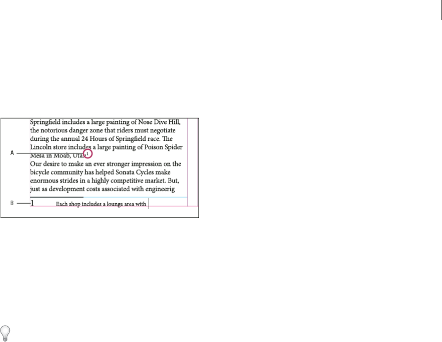
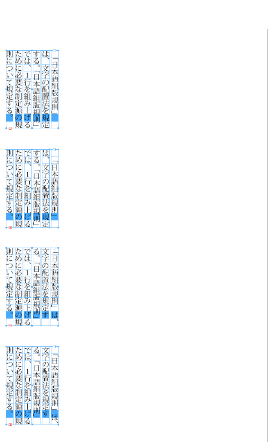
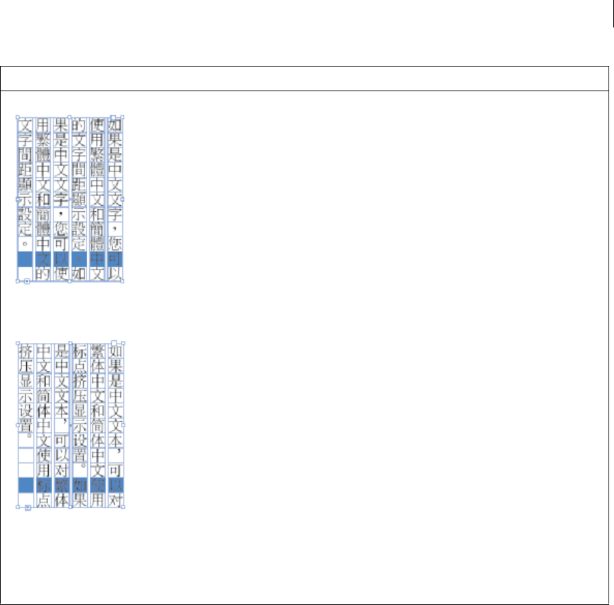
Control paragraph breaks using Keep Options
You can specify how many lines of the following paragraph remain with the current paragraph as it moves between
frames—a convenient way to ensure that headings don’t become isolated from the body text they introduce. InDesign
can highlight the paragraphs that sometimes break in violation of your settings.
You may not want to use Keep Options if your document does not require your columns to share the same last baseline.
To highlight paragraphs that violate Keep Options, choose Edit > Preferences > Composition (Windows) or InCopy >
Preferences > Composition (Mac OS), select Keep Violations, and click OK.
1Select the paragraph or paragraphs you want to affect.
2Choose Keep Options in the Paragraph panel menu or Control panel menu. (You can also change keep options when
creating or editing a paragraph style.)
3Choose Keep Options in the Paragraph panel menu. (You can also change keep options when creating or editing a
paragraph style.)
4Select any of these options and then click OK:
•Select Keep With Previous to keep the first line of the current paragraph with the last line of the previous
paragraph.
•For Keep With Next _ Lines, specify the number of lines (up to five) of the subsequent paragraph that the last
line of the current paragraph stays with. This option is especially useful for making sure that a heading stays with
the next few lines of the paragraph that follows it.
•Select the Keep Lines Together option and select All Lines In Paragraph to prevent the paragraph from breaking.
•Select the Keep Lines Together option, select At Start/End Of Paragraph, and specify the number of lines that
must appear at the beginning or ending of the paragraph to prevent orphans and widows.
•For Start Paragraph, choose an option to force InDesign to push the paragraph to the next column, frame, or
page. If Anywhere is selected, the start position is determined by the Keep Line Settings option. For other
options, they will be forced to start from these positions.
267
Typography
Last updated 6/15/2014
When you create paragraph styles for headings, use the Keep Options panel to make sure that your headings remain
with the paragraph that follows them.
Create hanging punctuation
The Optical Margin Alignment function is for Roman text. For more information on hanging of punctuation marks in
CJK text, see
Apply kinsoku hanging.
Punctuation marks and letters such as “W” can make the left or right edges of a column appear to be misaligned.
Optical Margin Alignment controls whether punctuation marks (such as periods, commas, quotation marks, and
dashes) and edges of letters (such as W and A) hang outside the text margins, so that the type looks aligned.
Before (left) and after (right) applying Optical Margin Alignment
1Select a text frame, or click anywhere in the story.
2Choose Type > Story.
3Select Optical Margin Alignment.
4Select a font size to set the appropriate amount of overhang for the size of type in your story. For optimal results, use
the same size as the text.
To turn off Optical Margin Alignment for an individual paragraph, choose Ignore Optical Margin from the Paragraph
panel menu or Control panel menu.
More Help topics
Add paragraph and character styles
Drop caps and nested styles
Apply a character style to a drop cap
Add column, frame, and page breaks
Formatting text
268
Typography
Last updated 6/15/2014
Format text
Use the Control panel to change the appearance of text. When text is selected or when the insertion point is placed in
text, the Control panel displays either the character formatting controls or the paragraph formatting controls, or a
combination of both, depending on your monitor resolution. These same text formatting controls appear in the
Character panel and Paragraph panel. You can also use the Character panel and Paragraphs panel to change the
appearance of text.
For a video tutorial on formatting characters, see www.adobe.com/go/lrvid4275_id. For a video tutorial on formatting
paragraphs, see www.adobe.com/go/lrvid4276_id.
Use the Character panel and Paragraphs panel to change the appearance of text. In InDesign, you can also use the
Control panel to format text. The Control panel is not available in InCopy.
Note the following methods of formatting text:
•To format characters, you can use the Type tool to select characters, or you can click to place the insertion point,
select a formatting option, and then begin typing.
•To format paragraphs, you don’t need to select an entire paragraph—selecting any word or character, or placing the
insertion point in a paragraph will do. You can also select text in a range of paragraphs.
•To set the formatting for all future text frames that you’ll create in the current document, make sure that the
insertion point is not active and that nothing is selected, and then specify text formatting options. To set default text
formatting for all new documents, close all documents, and then specify the text settings. See
Set defaults.
•Select a frame to apply formatting to all text inside it. The frame cannot be part of a thread.
•Use paragraph styles and character styles to format text quickly and consistently.
For a video tutorial on working with text, see www.adobe.com/go/vid0075.
1Select the Type tool .
2Select the Type tool or Vertical Type tool .
3Click to place an insertion point, or select the text that you want to format.
4In the Control panel, click the Character Formatting Control icon or the Paragraph Formatting Control icon
.
Control panel
A Character formatting controls B Paragraph formatting controls
5In the Control panel, click the Character Formatting Control icon or the Paragraph Formatting Control icon
.
Control panel
A Character formatting controls B Paragraph formatting controls
6Choose Type > Paragraph or Type > Character to display the Paragraph or Character panel.
7Specify formatting options.
269
Typography
Last updated 6/15/2014
Text formatting precedence
To format text with attributes such as font style and text direction, you can use several different methods. For example,
you can use the Control panel, frame grid options, or named grids or text styles. If you use more than one method and
attributes conflict with each other, InDesign must choose which attribute to use. The order of precedence is as follows:
1Character attribute overrides
2Character style
3Paragraph attribute overrides
4Paragraph style
5CJK grid attributes (either from a named grid or from Frame Grid Options dialog box)
6Application default (root paragraph style)
For example, if you specify one font size in the Frame Grid Options dialog box and a different font size in a character
style, the font size from character style is used. Similarly, if you include both a paragraph style and a named grid in an
object style, the paragraph style takes precedence over the named grid.
Format a frame grid
When you select a frame grid, options for formatting the grid are displayed in the Control panel.
1Using a selection tool, select a frame grid.
2Select any options in the Control panel.
Control panel (when frame grid is selected)
A Reference point B X Location C Y Location D Width E Height F Vertical scaling G Horizontal scaling H Character aki I Line aki J Grid
format name K
Grid view L Font size M Frame grid characters per line N Number of lines O Number of columns P Column gutter
Copy type attributes (Eyedropper)
You can use the Eyedropper tool to copy type attributes such as character, paragraph, fill, and stroke settings, and then
apply those attributes to other type. By default, the Eyedropper tool copies all type attributes. To customize the
attributes you want to copy with the Eyedropper tool, use the Eyedropper Options dialog box.
The Eyedropper tool is available only in Layout View.
Copy type attributes to unselected text
1With the Eyedropper tool , click the text that is formatted with the attributes you want to copy. (The text can be
in another open document.) The eyedropper pointer reverses direction, and appears full , to indicate that it’s
loaded with the attributes you copied. When you position the eyedropper pointer over text, an I-beam appears next
to the loaded eyedropper
.
2With the Eyedropper tool, select the text you want to change.
The selected text takes on the attributes loaded in the eyedropper. As long as the Eyedropper tool is selected, you
can continue to select text to apply formatting.
270
Typography
Last updated 6/15/2014
3To deselect the Eyedropper tool, click another tool.
To clear the formatting attributes currently held by the eyedropper tool, press Alt (Windows) or Option (Mac OS) while
the Eyedropper tool is loaded. The Eyedropper tool reverses direction and appears empty , to indicate that it’s ready
to pick up new attributes. Click an object containing the attributes you want to copy, and then drop the new attributes on
another object.
The eyedropper is clicked on formatted text to copy its formatting (left), and then dragged across unformatted text (middle) to apply that
formatting (right).
If you use the Eyedropper tool to copy a paragraph style from text in one document to text in another, and the
paragraph style has the same name but different sets of attributes, any style differences will appear as local overrides to
the destination style.
Copy type attributes to selected text
1With the Type tool or Path Type tool , select the text to which you want to copy attributes.
2Using the Eyedropper tool , click the text from which you want to copy attributes. (The text from which you
want to copy attributes must be in the same InDesign document as the text you want to change.) The Eyedropper
tool reverses direction and appears full
, to indicate that it’s loaded with the attributes you copied. The attributes
are applied to the text you selected in step 1.
Type attributes copied to selected text
Change which text attributes the Eyedropper tool copies
1In the toolbox, double-click the Eyedropper tool.
2Choose Character Settings or Paragraph Settings in the Eyedropper Options dialog box.
3Select the attributes you want to copy with the Eyedropper tool, and then click OK.
To copy or apply paragraph attributes only without having to change settings in the Eyedropper Options dialog box,
hold down Shift as you click text with the Eyedropper tool.
271
Typography
Last updated 6/15/2014
Use Quick Apply
Use Quick Apply to find and apply styles, menu commands, scripts, variables, and most other commands that can be
found in the Keyboard Shortcuts dialog box.
1Select the text or frame to which you want to apply the style, menu command, script, or variable.
2Choose Edit > Quick Apply, or press Ctrl+Enter (Windows) or Command+Return (Mac OS).
3Start typing the name of the item you want to apply.
The name you type doesn’t need to be an exact match. For example, typing he will locate styles such as Head 1, Head
2, and Subhead, as well as Help menu commands such as Help Menu > InDesign Help.
Use Quick Apply to find styles, menu commands, scripts, and variables.
You can narrow the search to only a single category by typing the appropriate prefix at the beginning of the search,
such as m: for menu or p: for paragraph styles. To view a list of prefixes, click the down arrow to the left of the Quick
Apply text box. You can deselect categories in this list that you don’t want to appear.
4Select the item you want to apply, and then:
•To apply a style, menu command, or variable, press Enter or Return.
•To apply a paragraph style and remove overrides, press Alt+Enter (Windows) or Option+Return (Mac OS).
•To apply a paragraph style and remove overrides and character styles, press Alt+Shift+Enter (Windows) or
Option+Shift+Return (Mac OS).
•To apply an item without closing the Quick Apply list, press Shift+Enter (Windows) or Shift+Return (Mac OS).
•To close the Quick Apply list without applying an item, press Esc or click anywhere else in the document window.
•To edit a style, press Ctrl+Enter (Windows) or Command+Return (Mac OS).
When the Quick Apply list is displayed, press the left and right arrow keys to scroll through the edit field; press the up
and down arrow keys to scroll through the list of items.
More Help topics
Working with Text video
Control panel overview
Apply colors using the Eyedropper tool
272
Last updated 6/15/2014
Chapter 8: Tables
Table and cell styles
About table and cell styles
Just as you use text styles to format text, you can use table and cell styles to format tables. A table style is a collection of
table formatting attributes, such as table borders and row and column strokes, that can be applied in a single step. A cell
style includes formatting such as cell insets, paragraph styles, and strokes and fills. When you edit a style, all tables or
cells to which the style is applied are updated automatically.
Note: There is one important difference between text styles and table styles. While all character styles attributes can be part
of a paragraph style, cell style attributes are not part of the table style. For example, you cannot use a table style to change
the border color of interior cells. Instead, create a cell style and include it in the table style.
[Basic Table] and [None] styles
By default, each new document contains a [Basic Table] style that can be applied to tables you create and a [None] style
that can be used to remove cell styles applied to cells. You can edit the [Basic Table] style, but you can’t rename or delete
either [Basic Table] or [None].
Using cell styles in table styles
When you create a table style, you can specify which cell styles are applied to different regions of the table: header and
footer rows, left and right columns, and body rows. For example, for the header row, you can assign a cell style that
applies a paragraph style, and for the left and right columns, you can assign different cell styles that apply shaded
backgrounds.
Cell styles applied to regions in table style
A Header row formatted with cell style that includes paragraph style B Left column C Body cells D Right column
Cell style attributes
Cell styles do not necessarily include all the formatting attributes of a selected cell. When you create a cell style, you can
determine which attributes are included. That way, applying the cell style changes only the desired attributes, such as
cell fill color, and ignores all other cell attributes.
Formatting precedence in styles
273
Tables
Last updated 6/15/2014
If a conflict occurs in formatting applied to a table cell, the following order of precedence determines which formatting
is used:
Cell style precedence1. Header/Footer 2. Left column/Right column 3. Body rows. For example, if a cell appears in
both the header and the left column, the formatting from the header cell style is used.
Gebruikershandleiding.com neemt misbruik van zijn services uitermate serieus. U kunt hieronder aangeven waarom deze vraag ongepast is. Wij controleren de vraag en zonodig wordt deze verwijderd.
Product:
Spelregels forum
Om tot zinvolle vragen te komen hanteren wij de volgende spelregels:
lees eerst de handleiding door;
controleer of uw vraag al eerder door iemand anders is gesteld;
probeer uw vraag zo duidelijk mogelijk te stellen;
heeft u een probleem en al geprobeerd om dit op te lossen, vermeld dit erbij aub;
heeft u een oplossing gekregen van een bezoeker dan horen wij dat graag in dit forum;
wilt u een reactie geven op een vraag of antwoord, gebruik dan niet dit formulier maar klik op de knop 'reageer op deze vraag';
uw vraag wordt direct op de website gezet; vermijd daarom persoonlijke gegevens in te vullen;
Belangrijk! Als er een antwoord wordt gegeven op uw vraag, dan is het voor de gever van het antwoord nuttig om te weten als u er wel (of niet) mee geholpen bent! Wij vragen u dus ook te reageren op een antwoord.
Belangrijk! Antwoorden worden ook per e-mail naar abonnees gestuurd. Laat uw emailadres achter op deze site, zodat u op de hoogte blijft. U krijgt dan ook andere vragen en antwoorden te zien.
Abonneren
Abonneer u voor het ontvangen van emails voor uw Adobe InCopy CC - 2014 bij:
nieuwe vragen en antwoorden
nieuwe handleidingen
U ontvangt een email met instructies om u voor één of beide opties in te schrijven.
Ontvang uw handleiding per email
Vul uw emailadres in en ontvang de handleiding van Adobe InCopy CC - 2014 in de taal/talen: Engels als bijlage per email.
De handleiding is 9,27 mb groot.
U ontvangt de handleiding per email binnen enkele minuten. Als u geen email heeft ontvangen, dan heeft u waarschijnlijk een verkeerd emailadres ingevuld of is uw mailbox te vol. Daarnaast kan het zijn dat uw internetprovider een maximum heeft aan de grootte per email. Omdat hier een handleiding wordt meegestuurd, kan het voorkomen dat de email groter is dan toegestaan bij uw provider.
Uw handleiding is per email verstuurd. Controleer uw email
Als u niet binnen een kwartier uw email met handleiding ontvangen heeft, kan het zijn dat u een verkeerd emailadres heeft ingevuld of dat uw emailprovider een maximum grootte per email heeft ingesteld die kleiner is dan de grootte van de handleiding.
Er is een email naar u verstuurd om uw inschrijving definitief te maken.
Controleer uw email en volg de aanwijzingen op om uw inschrijving definitief te maken
U heeft geen emailadres opgegeven
Als u de handleiding per email wilt ontvangen, vul dan een geldig emailadres in.
Uw vraag is op deze pagina toegevoegd
Wilt u een email ontvangen bij een antwoord en/of nieuwe vragen? Vul dan hier uw emailadres in.